Sunday 28 April 2013

Welcome Moderator to my A2 Media Studies Blog!


The below posts contain: My music promotional video, magazine advert and the album artwork (digipak). The posts below will visually show my thought processes as the product developed from the initial idea, to final products. My evaluation questions are on 4 separate pageswhich can be easily seen at the top of my Blog.


Piers Harrop 1030
Claremont Fan Court School: 64680
OCR A2 Media Studies
April 2013
Video Brief:
To create a music video along with its ancillary products.

FINISHED PRODUCT- MUSIC VIDEO

 Please watch the DVD disk for a higher quality video.


FINISHED PRODUCT-DIGIPACK


FINISHED PRODUCT- MAGAZINE ADVERT

Wednesday 27 March 2013

CONSTRUCTION: TRACKING BAND PERFORMANCE SCENE TO PHONE


Click to watch a Tutorial video

 I chose to track and insert some of my band performance footage onto a piece of footage where two friends are apparently watching my music video. This will provide an illusion that the friends are watching the video together. The phone also is related to the lyrics where it is placed 'pictures on my phone'.

Thursday 21 March 2013

FEEDBACK: FACEBOOK PAGE

I have created a facebook page on my project. Here I will be able to recieve feedback from my targeted age market and recieve their thoughts and anything they think I can improve on. Through Social Media I can also advertise my product. You can access this page by clicking on the link: FACEBOOK PAGE


CONSTRUCTION: MY ALBUM FRONT COVER

Here are two different versions of album front cover I designed for our project. I have altered the design from the original draft as my groupmate and I both agreed that showing the faces of the band members and having them filling up the whole cover would suit the band more, as it is energetic, loud and bold.

The difference between these two covers are that the first one has a watermark effect, which seems more artistic and alternative; and the second one has a smaller band logo but the band members are on the foreground, which is loud and clear.

I like both of them as they both carry different messages and create different effects. Therefore, we are going to show these to our target audience when we have finished the back cover and get some feedback.


CONSTRUCTION: FILMING OUR NARRATIVE

Since the narrative in our music video isnt complete and some footage was badly lit, we decided to redo it. So we went to Esher train station and I filmed the lead singer and two of his friends driving to the train station, walking towards the platform, getting on a train and going on a holiday.

CONSTRUCTION: THE BACK COVER

After finishing the the front cover i decided that for the backcover I would like to keep the dripping effect and the colourful background, as it is energetic and loud, which suits the band.

Backcover background- painted by watercolour
Here is one of the photographs that I took for the band and I decided to put this on the back cover. It shows two of the members having fun and laughing, which seems really generic.

CONSTRUCTION: BACK COVER OF ALBUM

Here is the back cover I designed for my project I used the watermark effect again, which I really like because it is bright and colourful, which suits the message of "Good Life".

I also added a bar code, the producers' logos and the FBI anti-piracy logo to make the cover more realistic and professional.


CONSTRUCTION: MAGAZINE ADVERT FINAL


CONSTRUCTION: BACKGROUNDS FOR ALBUM


CONSTRUCTION: PHOTO-SHOOT FOR ALBUM FRONT COVER


Monday 18 March 2013

CONSTRUCTION: BASIC 3D EFFECT

I chose to add a 3d effect to all of my footage to make the image look as realistic as possible and to make the audience feel that they are there in the same environment with the band. This will hopefully create a feeling of energy. The 3D effect works by applying a fish-eye lense  effect to the footage.

Thursday 14 March 2013

CONSTRUCTION: PLANNING FOR OUR NEXT FILM SHOOT

In order to prepare for tomorrow's filming, I have done a sheet of camera shots and angles I am planning to film to make sure we will be able to get everything done smoothly and efficiently.

I have purposely chosen to use close up shots of myself whistling to try to entice the consumer when they watch my music video to do the same and whistle along with the song. This will therefore help to make the song more intereactive and furthers the energetic mood I wish to construct through my video.
These will go into the band performance scenes.

CONSTRUCTION: ALBUM FRONT COVER BACKGROUND


BACKGROUND OF ALBUM COVER
In today's lesson, I went to the art department and worked on our album cover. In order to create a watery, colourful and energetic effect, I used acrylic paint and adopted the 'wet on wet' method to create the background of the front cover. I really like the outcome because it is eye catchy and the colours blend in really well. I also like the dripping effect because it shows movement, and the flow of water and paint. I will then work on the other sides of the digipack based on this theme.

CONSTRUCTION: LOGO FOR ALBUM

Today, I created the logo of the song and the band name for our project, this is based on the initial design I did last month. I edited it on Photoshop and by filling in colours and enhancing the shades to make it look more professional. I really like this logo because it is bright, vibrant, loud and energetic which suits the song and the band image.
INITIAL DESIGN

COMPLETED LOGO

Sunday 10 March 2013

PLANNING: MAGAZINE ADVERT PRACTICE


After reflection, I believe that this magazine advert appears to be too dark for the tone and mood we want to set with our video and album, which is vibrancy, bright and colourful. Furthermore the magazine advert appears to contrast in the background too much, making it appear in two seperate halves. I will be redesigning this using my final album cover design and I will construct the advert to be more colourful and vibrant to give the consumer a sense of fun and energy.

PLANNING: ALBUM COVER TESTS

I produced some tester album covers to help with our design process. I did this using photoshop. I believe that by doing this process I am able to confirm that I want a creative and more artistic album compared to tradition conventional digipacks. I will use watercolour as to construct the background rather than pencil and paint on photoshop.


Thursday 7 March 2013

PLANNING: VIDEO TRACKING

We researched how to track screen footage as we wish to crop and import our band performance footage on  the phone to give the illusion that these friends are watching the music video
 I will do this using adobe after effects.


PLANNING: ALBUM COVER

DRAFT TEST FOR MY ALBUM COVER


 I HAVE GAINED INSPIRATION FROM THESE TEXT FONTS BELOW:


This style of font has often been associated with American qualities and often has been used to connote baseball, football and many clothing brands for example 'American Eagle'.  The font style is similar to that of cursive script  and has connotations of representing youth, energy and a laid back vibe. This is what we want to represent in our album cover and music video. Furthermore, this font being often associated with American brands, we felt it would be appropriate to use it as 'One Republic' itself is an American Band. By using this popular font we hope our album will then appeal to consumers of products and things with such text for example sports fanatics and teenagers that are eager to have the latest designer fashion labels.


MY OWN CONSTRUCTION OF THE ALBUM TITLE:


CONSTRUCTION- COLOUR CORRECTION DURING EDITING


In this lesson I colour corrected all of my footage. Above is an example of this. On the left you can see the original and on the right the edited version.

Wednesday 6 March 2013

PLANNING EVALUATION QUESTION 1

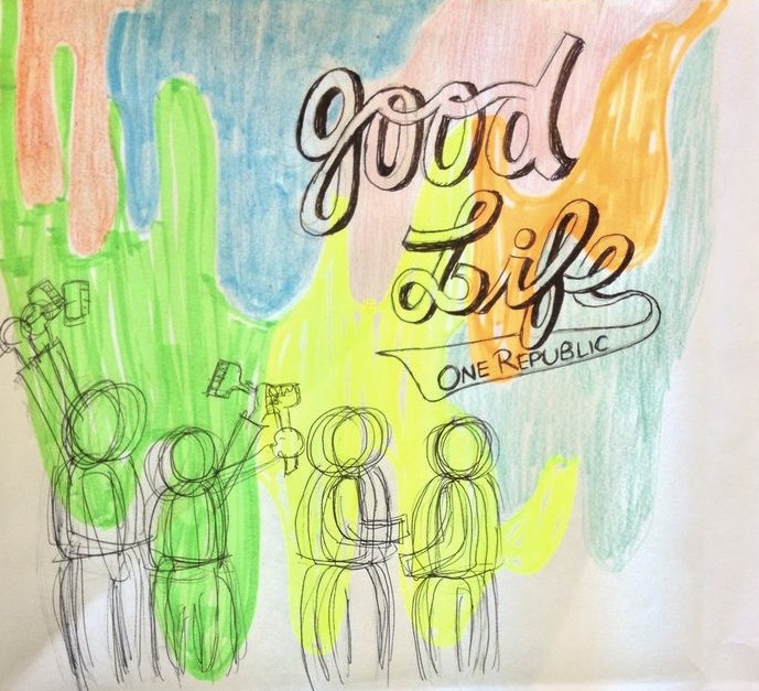
Thought beats-Genre- Indie rock Upbeat and fairly fast-paced- laid back and relaxing song For Goodwin, 'thought beats mean seeing the sound in your head'. stop motion is cut to beat.

Chorus- scenes are not repeated. For Barthes, (grain of voice) 'singing voices as a expressive instrument and therefore able to make associations of its own' Singer is upbeat, energetic, calm and non-assaultive on the ears, which suit the style of the song and the meaning of the lyrics. casual relaxing Technical aspect- Lighting helps sets the mood - Mostly under sunlight, bright and vibrant colours to create a 'golden' effect to emphasise the visual image of a beautiful and good life.

setting: Outdoor for band performance and solos Train station for narrative- going on a holiday, having a good time - Creates verisimilitude as it is a place where everyone goes all the time

RICHARD DYER Star Image- Laid back cast to represent a chilled band, more like a group of friends gathering together having a good time, rather than a serious performance.- promote the idea of good life: having fun and enjoying ourselves

ILLUSTRATE The scenes of the lead singer walking down the high street to the train station and getting on a train illustrate the lyrics of the song (ie.- promote the idea of good life: having fun and enjoying ourselves

HEIDI PETERS

DANCING IN THE DREAM FACTORY- STEVE ARCHER

SEMITOTICS

RESEARCH: WHERE DO PEOPLE CONSUME MUSIC


I have found a infographic showing the music preferences of people in the people's poll in 2008 which was conducted my LM radio. This research has shown me that technology is advancing and more and more people are using portable devices such as phones rather than CDs to listen to music. This Infographic also shows that 74.3% of consumers need to know the name of the singer and song title when it comes to their favourite tunes. Therefore I will make sure that the song name and band name is clearly present so that consumers can instantly recognise the name and band. This will be particlulary evident on my album and magazine advert.


It


RESEARCH: DIGIPACK REVOLUTION

Tuesday 5 March 2013

CONSTRUCTION: STOP-MOTION FOR CHORUS


BELOW ARE PICTURES OF THE STOP MOTION WE ARE GOING TO USE IN OUR MUSIC VIDEO CHORUS. WE CHOSE TO USE STOP MOTION AS IT WILL ADD A SENSE OF DIVERSITY AND VIBRANCY. WE TOOK PICTURES OF PIECES OF COLOURED PAPER AND EDITED THEM IN PHOTOSHOP TO BOLDEN AND COLOUR THE LETTERS. THE PICTURES BELOW ARE THE FINISHED EDITED VERSIONS:


BELOW ARE THE EDITED PHOTOS: