After reflection, I believe that this magazine advert appears to be too dark for the tone and mood we want to set with our video and album, which is vibrancy, bright and colourful. Furthermore the magazine advert appears to contrast in the background too much, making it appear in two seperate halves. I will be redesigning this using my final album cover design and I will construct the advert to be more colourful and vibrant to give the consumer a sense of fun and energy.
Sunday, 10 March 2013
PLANNING: ALBUM COVER TESTS
I produced some tester album covers to help with our design process. I did this using photoshop. I believe that by doing this process I am able to confirm that I want a creative and more artistic album compared to tradition conventional digipacks. I will use watercolour as to construct the background rather than pencil and paint on photoshop.
Saturday, 9 March 2013
RESEARCH: CD MAGAZINE ADVERT ANALYSIS
My team mate and I analysed existing magazine adverts to help us in the design process of our own.
Thursday, 7 March 2013
PLANNING: VIDEO TRACKING
PLANNING: ALBUM COVER
![]() | ||||
| DRAFT TEST FOR MY ALBUM COVER |
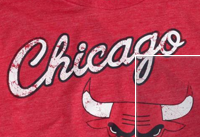
I HAVE GAINED INSPIRATION FROM THESE TEXT FONTS BELOW:

This style of font has often been associated with American qualities and often has been used to connote baseball, football and many clothing brands for example 'American Eagle'. The font style is similar to that of cursive script and has connotations of representing youth, energy and a laid back vibe. This is what we want to represent in our album cover and music video. Furthermore, this font being often associated with American brands, we felt it would be appropriate to use it as 'One Republic' itself is an American Band. By using this popular font we hope our album will then appeal to consumers of products and things with such text for example sports fanatics and teenagers that are eager to have the latest designer fashion labels.
MY OWN CONSTRUCTION OF THE ALBUM TITLE:
CONSTRUCTION- COLOUR CORRECTION DURING EDITING
In this lesson I colour corrected all of my footage. Above is an example of this. On the left you can see the original and on the right the edited version.
Subscribe to:
Posts (Atom)